Changing settings
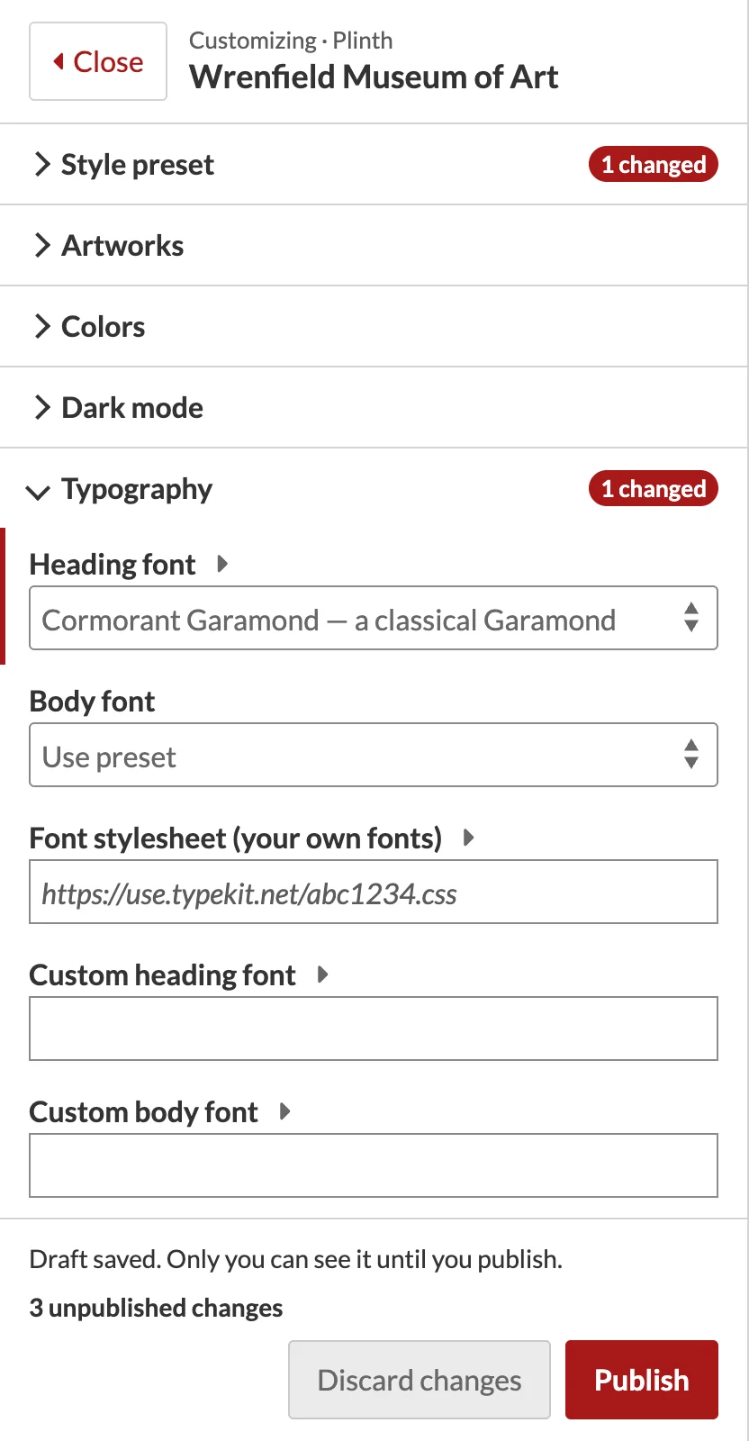
Open a section (Colors, Typography, Header…) and change a setting. The preview follows:
- Instantly for colors, fonts and type, spacing, page width, corners and buttons, shadows, header layout and color, announcement bar and footer colors, card styles, logo size and custom CSS. Text fields update once you pause typing.
- By reloading the page for everything that changes what a page contains: logos, site title and tagline, the announcement, footer columns and links, partner logos, menus, browse and item page layouts, dark mode, and sticky header. The preview comes back at the same scroll position.
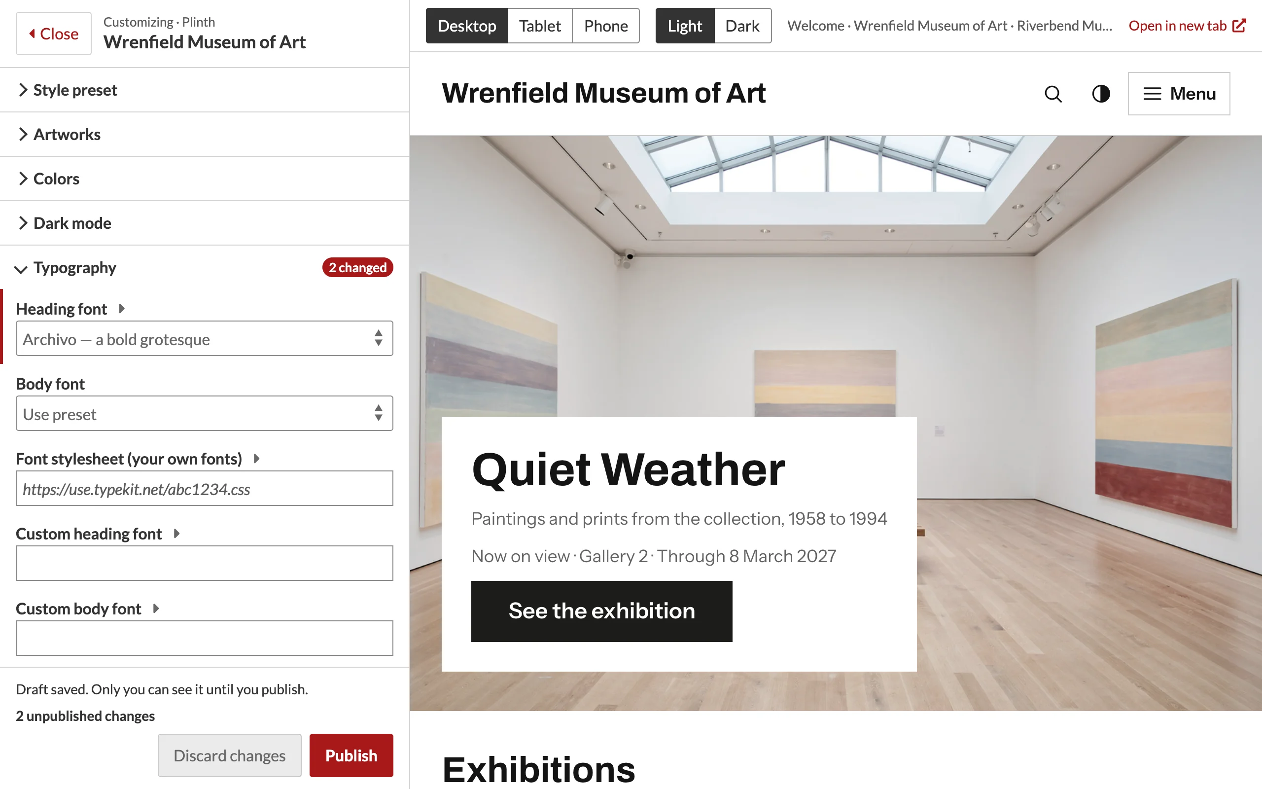
Instant and reload settings lists every setting.
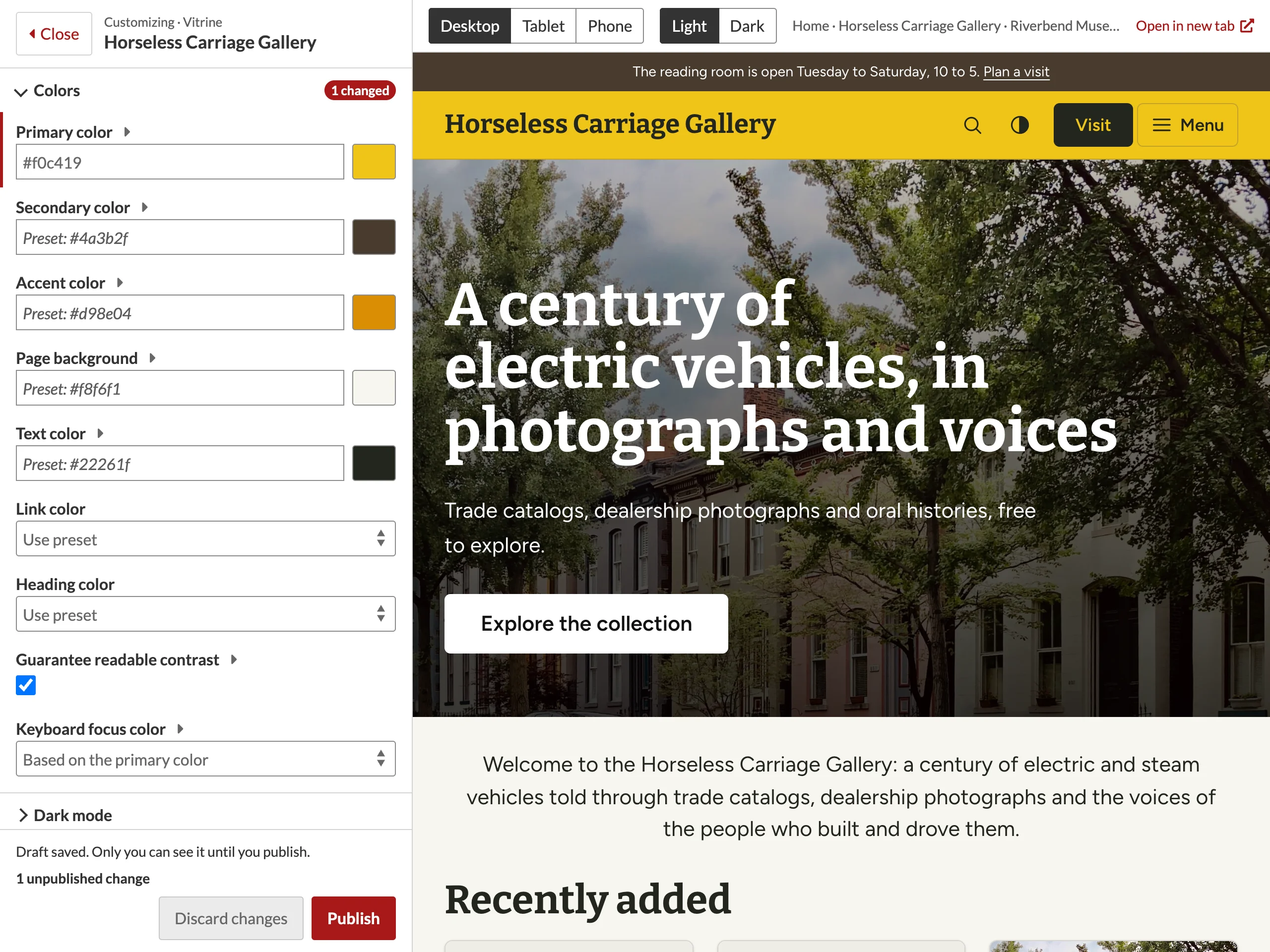
Settings left blank, or set to Use preset, follow the style preset. A color field left blank shows the preset's color in its swatch and as a hint (for example Preset: #2d5f8b).
Picking colors
Type a hex color (#2d5f8b or #28b) in a color field, or click the swatch next to it to use your browser's color picker. With Guarantee readable contrast on (the default), the theme adjusts colors where needed so text stays readable; the preview shows the adjusted result.
Values that are not accepted
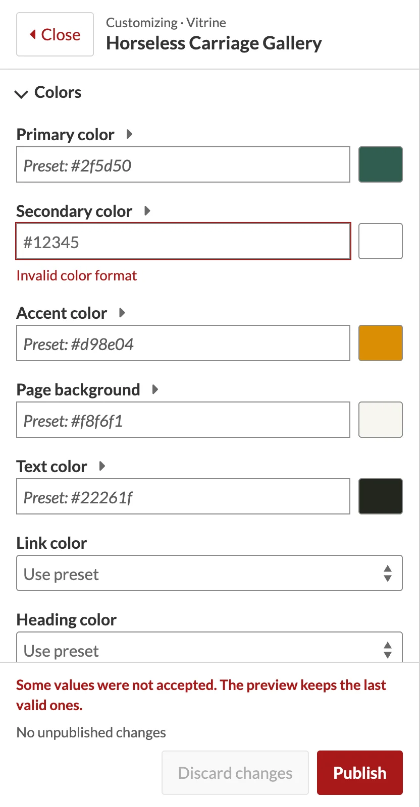
A value the theme does not accept, such as #12345 in a color field, is marked in red with the reason under the field, and the status line says so. The preview keeps the last accepted value until you correct it.
Browsing the preview
Links in the preview work: open an item, a browse page or a search, and the draft follows you. Links to other websites open in a new tab. Open in new tab shows the current page full size, still with your draft; a label at the bottom of the page reminds you it is a preview.
Widths and color schemes
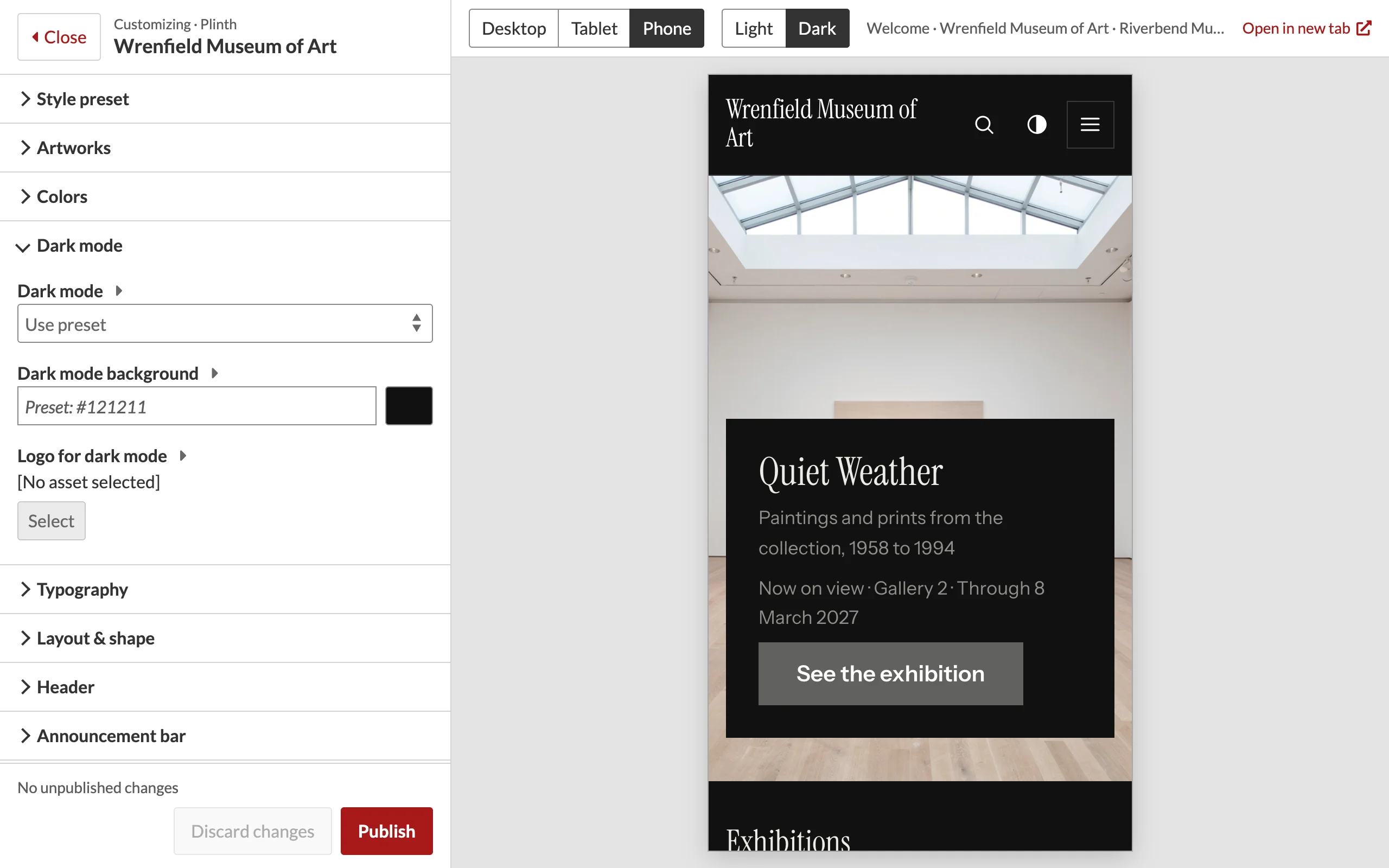
- Desktop, Tablet (768 px) and Phone (390 px) set the preview's width.
- Light and Dark switch the preview's color scheme without changing your settings. When the theme's Dark mode setting is Off, only Light is available; when it is Always dark, only Dark.
Seeing what you changed
Changed settings are marked with a red bar in the panel, and each section shows how many of its settings changed. The bottom of the panel shows the total, for example 3 unpublished changes.