Settings in Browse pages, Item pages and Exhibits, on the theme's settings page (Appearance › Themes › Configure Theme).
Browse pages
These settings apply to the browse pages of items, collections and exhibits, search results, and the cards on the home page and in shortcodes.
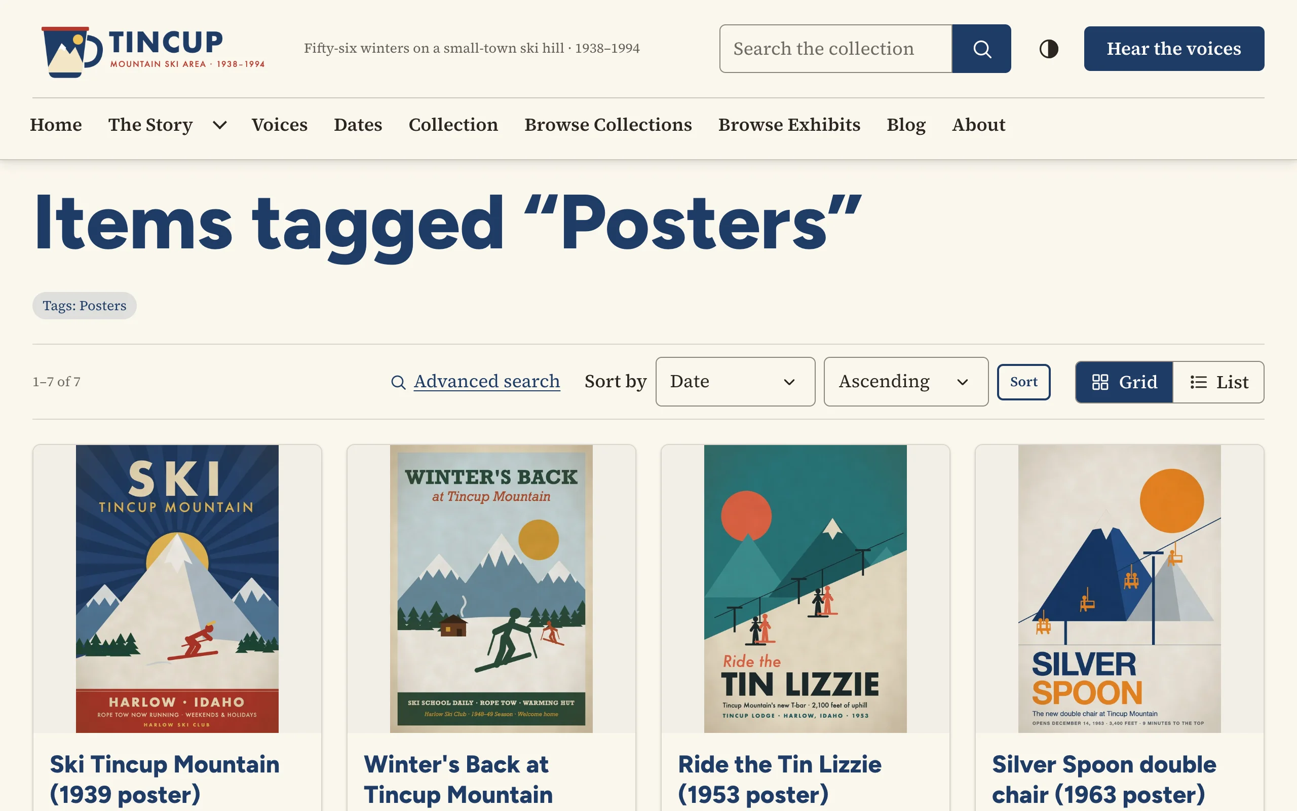
| Setting | Choices |
|---|---|
| Default layout | Grid of cards · List |
| Let visitors switch between grid and list | On by default. A visitor's choice is remembered. |
| Card style | Framed · Minimal (no frame) · Title over the image |
| Card image shape | Landscape (4:3) · Square · Portrait (3:4) · Wide (16:9) · Original proportions |
| Card image fit | Fill the frame (edges may be cropped) · Show the whole image |
| Card size | Automatic, or about 2, 3, 4 or 5 cards per row on a wide screen. Rows always reflow on smaller screens. |
| Description on cards | First three lines · First five lines · Full description · In list view only (three lines in list view, none in a grid) · Hidden |
| Line under the card title | Item type and date ("Still Image · 1952") · Type and date (the Dublin Core Type, such as "Poster · 1952", or the item type where an item has none) · Creator and date · Date only · Nothing |
The number of cards per page is Omeka's Results Per Page (public) under Appearance › Settings. Card pictures are Omeka's thumbnails and full-size copies of each item's first file.
Item pages
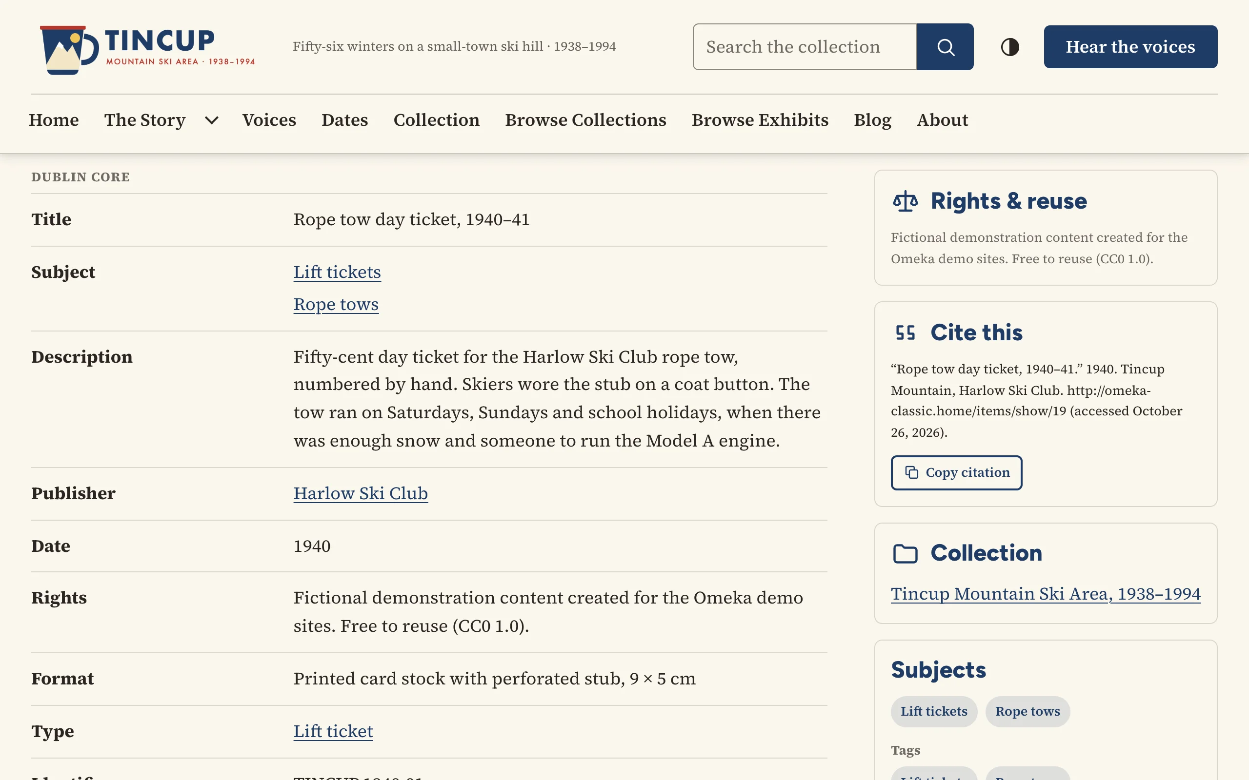
| Setting | What it does |
|---|---|
| Page layout | Sidebar on the right · Sidebar on the left · Single column (sidebar below) |
| Files on item pages | Gallery: one large file, with thumbnails of the others · Grid of all files · Each file at full width, one after another |
| Wall label | A museum-style caption at the top of the sidebar: artist, title and date, medium, dimensions, credit line and number. Off by default. |
| Previous and next links through the item's collection | On by default. |
| Rights & reuse, Cite this, Share | Sidebar panels, on by default. |
| Downloads | Links to each file's original, with its format and size. Off by default. |
| Subject and tag links | The item's subjects and tags as links to other items with the same ones. On by default. |
| Shorten long value lists | Elements with more values than this show the first few and a "Show all" button. 0 always shows every value. |
The item's collection is always in the sidebar when it has one. What each panel shows, and which Dublin Core elements the wall label reads, is in Item and file pages. File and collection pages follow the same layout and panels.
Exhibits
Exhibit navigation puts an exhibit's table of contents beside each page, in a menu above it, or leaves only previous and next links. Exhibit cover shows an exhibit's cover image as a large banner with the title, beside the description, or not at all. See Exhibits.