On Omeka Classic, the theme builds the home page from its settings: open Appearance › Themes, click Configure Theme, and fill in the Home page section. From top to bottom, the page shows a banner, your welcome text, featured exhibits, featured items, featured collections and recently added items, then anything plugins add to the home page. A section without content is left out.
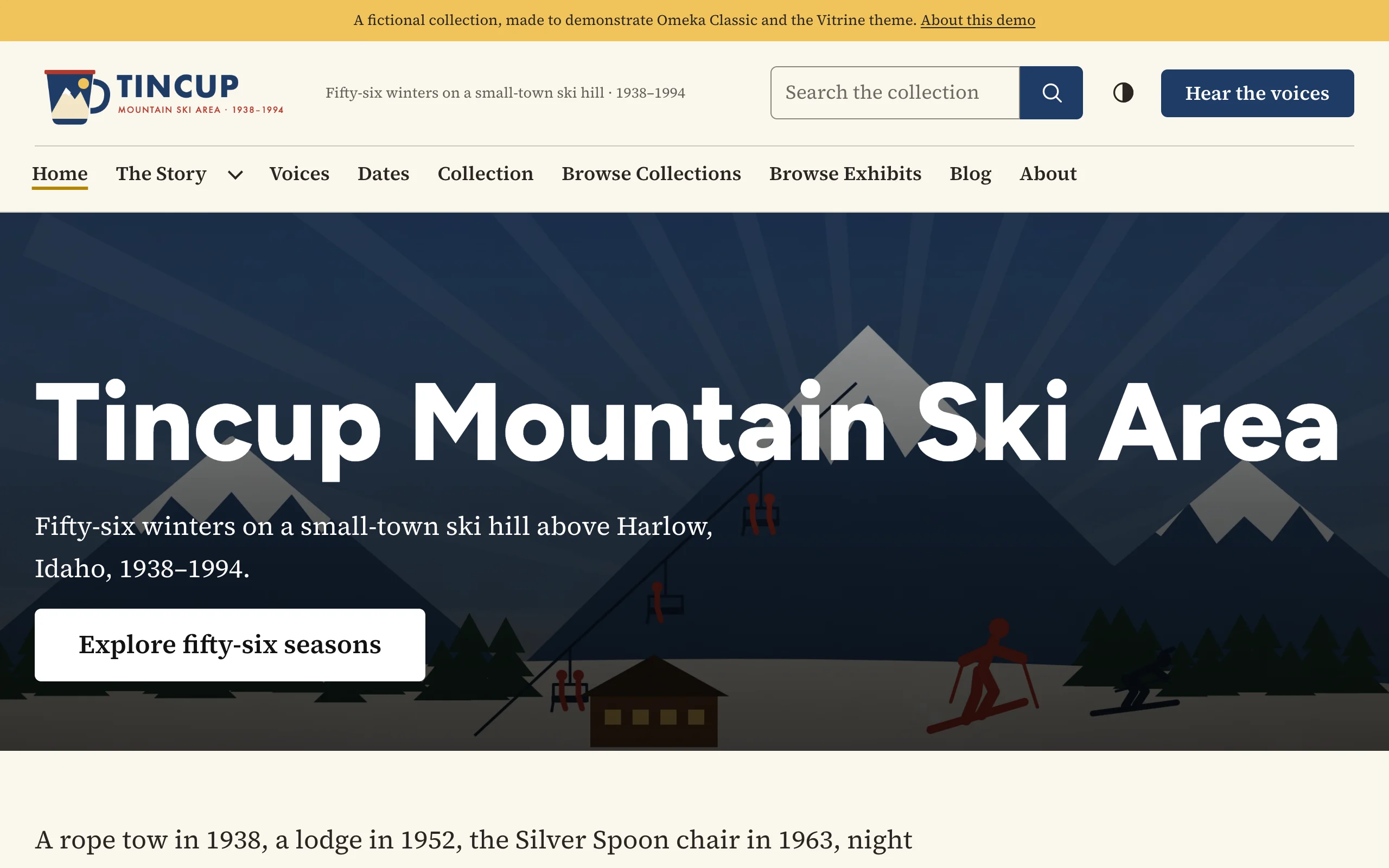
Banner
| Setting | What it does |
|---|---|
| Banner image | A wide picture across the top of the page, at least 1600 pixels wide. PNG or JPG, up to 1 MB. |
| Banner image from an item | The number (ID) of an item whose first image fills the banner, used when no banner image is uploaded. The banner then names the item and links to it. |
| Banner heading | The big title on the banner. Leave it blank to use the site's title. |
| Banner text | A sentence or two under the heading. |
| Banner button label, Banner button link | An optional button, such as "Explore the collection" linking to /items/browse. The link is a path on your site or a full address (https://…). |
| Banner style | Text over the image, the image beside the text, or the text below the image. Some themes offer their own choices: their settings pages describe them. |
An item's number is in the address of its page: /items/show/42 is item 42. The Configure Theme page takes uploads up to 1 MB; an item's image has no such limit. When the item's file is a JPG, PNG or WebP of up to 2.5 MB, the banner shows the original; otherwise it shows Omeka's full-size copy, which is at most 800 pixels wide unless you raise Fullsize Image Size under Appearance › Settings (to 1600 or 2000 for banners). Omeka makes its copies when a file is added, so add the image to the item again after changing the size.
An uploaded banner image is treated as decoration, so screen readers skip it: put what matters in the heading and text. A banner from an item uses the file's alt text as its text alternative (see Accessibility).
Without any image, the banner is the heading, text and button alone, on a band of color or on the page, depending on the theme.
Text on a picture lies on a dark scrim, so it stays readable on any photo.
Welcome text
Welcome text is shown below the banner. It is written in Omeka's rich-text editor, and everything that works on a Simple Page works here:
- shortcodes, such as
[featured_items num=4]or[collections], to show records as the theme's cards; - the theme's content classes: a lead paragraph, a callout, two columns, a pull quote, a call to action, link cards, a picture gallery and more.
To use a content class, click the editor's Source code button and paste the HTML. See Simple Pages and content classes for every class with an example, and for what Omeka's HTML filter lets through.
Featured and recent records
| Setting | Choices |
|---|---|
| Featured exhibits | Hide · 1 (large) · 2 · 3. Exhibits marked Featured and Public, in random order. One exhibit is shown large, with its cover image, description and a View the exhibit button; two or three as cards. Needs the Exhibit Builder plugin. |
| Featured items | Hide · 3 · 4 · 6 · 8. Items marked Featured, in random order on each visit. |
| Featured collections | Hide · 2 · 3 · 4 · 6. Collections marked Featured, with a link to all collections. |
| Recently added items | Hide · 4 · 6 · 8 · 12. The newest public items, with a link to browse them all. |
Tick Featured on an item's, collection's or exhibit's edit page in the admin. Records that are not public never appear.
The cards follow the theme's Browse pages settings, such as the line under the card title.
What plugins add
Plugins that add to the home page (through Omeka's public_home hook) appear below the theme's sections, in the page's width.
Using a Simple Page as the home page
To build the home page yourself, write it as a Simple Page and choose it under Appearance › Navigation › Select a Homepage. The theme then shows that page's text across the page, without a title, breadcrumbs or section menu, and the Home page settings are not used. Content classes such as the banner (v-hero), lead paragraph and call to action make a full home page this way: see Simple Pages and content classes.