On Omeka Classic, the theme lays out item pages itself, and you choose what they show in the Item pages section of its settings (Appearance › Themes › Configure Theme).
What an item page shows
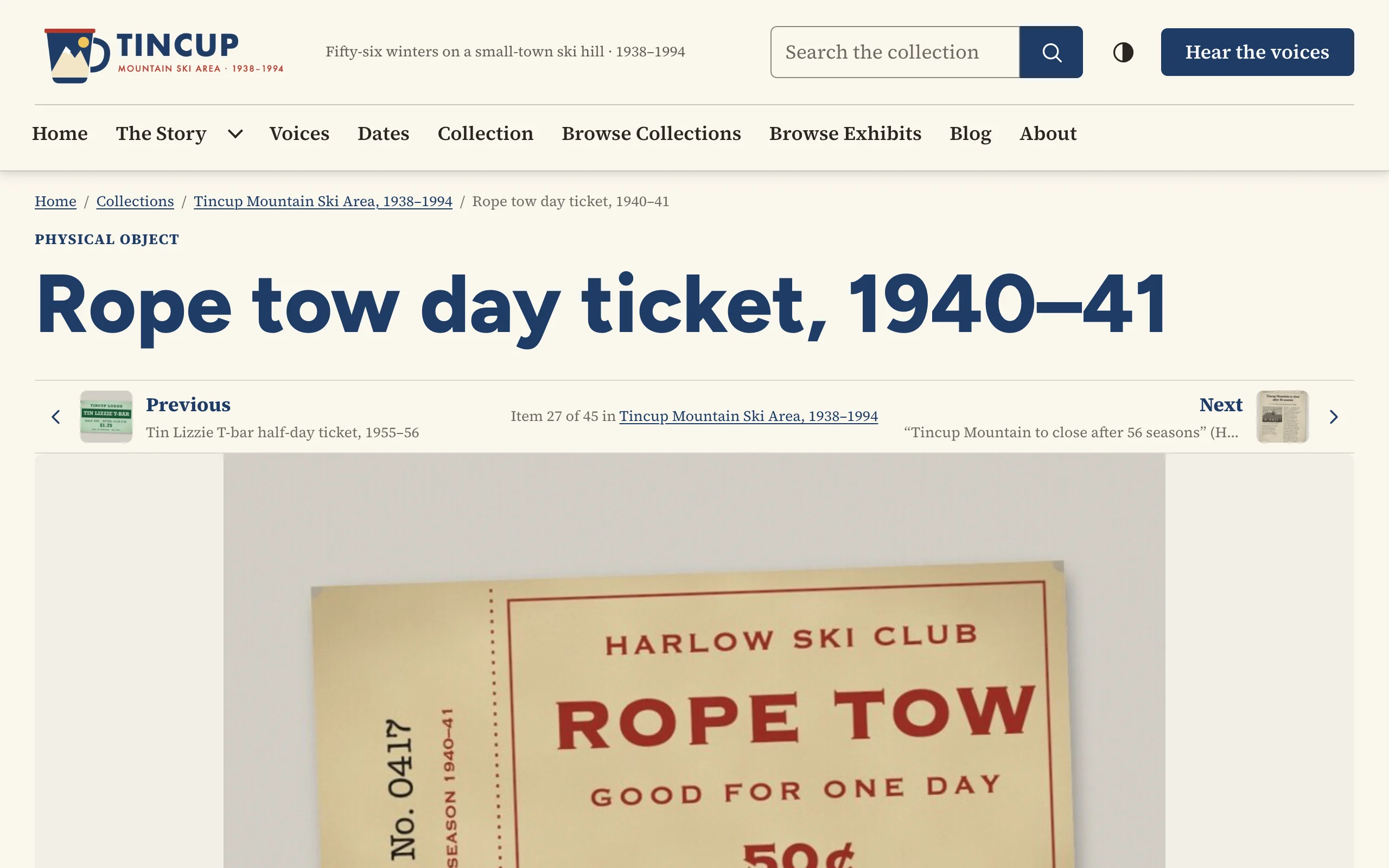
From top to bottom:
- Breadcrumbs, the item's type (its item type, such as "Still Image", or its Dublin Core Type in themes whose cards show types) and its title.
- Previous and next links through the item's collection.
- The item's files.
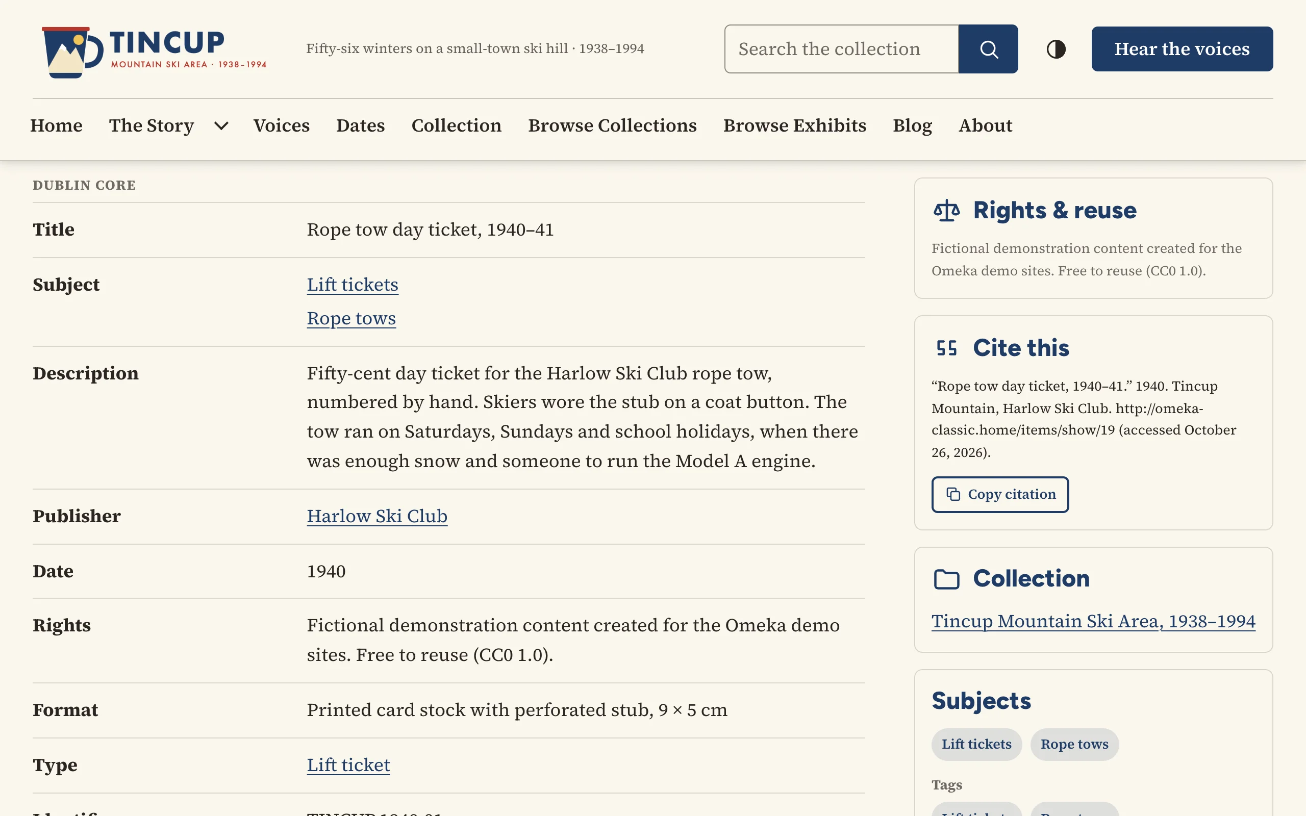
- Its metadata, beside a sidebar of panels: wall label, rights and reuse, citation, collection, subjects and tags, sharing and downloads.
- On a person's page, their works as cards (where the theme offers it).
- What plugins add to item pages, such as a Geolocation map, comments or related items, in the page's width.
Settings
| Setting | What it does |
|---|---|
| Page layout | Sidebar on the right · Sidebar on the left · Single column (sidebar below). Some themes word this for their own design, such as the wall label beside a work. |
| Files on item pages | Gallery: the first file large, the others as thumbnails below it. Grid: every file at the same size. Each file at full width, one after another. |
| Wall label | The caption a museum hangs beside a work, at the top of the sidebar (see below). |
| A person's works | On a person's page, the items they created, as cards (see below). |
| Previous and next links through the item's collection | On by default. |
| Rights & reuse | The item's Rights and License as plain-language labels. On by default. |
| Cite this | A ready-made citation with a copy button. On by default. |
| Share | Copy link, email and the device's own share menu, with no third-party scripts or tracking. On by default. |
| Downloads | A link to each file's original, with its format and size. Off by default. |
| Subject and tag links | The item's subjects and tags as links to the other items that share them. On by default. |
| Shorten long value lists | Elements with more values than this show the first few and a "Show all" button. 0 always shows every value. |
Each theme shows the settings that suit it and sets the others itself. The item's collection is always shown in the sidebar when it has one.
Files
Images open in an accessible viewer, at their original size, with previous and next buttons through the item's images; the Escape key closes it. Each file's title links to its own page. Other files (audio, video, PDFs, documents) are shown by Omeka, so plugins such as Html5 Media and PDF Embed show them in a player or viewer: see Plugin integrations.
An image's text alternative is its file's Dublin Core Description, else the file's Title, else the item's title. Describe what matters in each image in the file's Description, especially images that contain text.
The large image is Omeka's full-size copy, at most 800 pixels wide unless you raise Fullsize Image Size under Appearance › Settings.
Metadata
The item's elements are listed under their names, grouped by element set ("Dublin Core", "Still Image Item Type Metadata") when Appearance › Settings › Show Element Set Headings is on. Show Empty Elements lists elements without a value too; most sites leave it off. Dates written the machine way (1993-04-09) read as people write them ("April 9, 1993").
Previous and next in a collection
The Previous and next links let visitors step through a collection without going back to it, with the item's position in it ("Item 12 of 28"). They follow the order the visitor chose on the collection's browse page, else the newest first, as Omeka lists items.
Arriving from a collection's items, the breadcrumbs also lead back through it ("Home / Collections / Collection / Item"). The links show nothing for items without a collection, or alone in theirs.
Rights & reuse
The panel reads the item's Dublin Core Rights, and License and Access Rights (which come with the Dublin Core Extended plugin). A RightsStatements.org or Creative Commons address, such as http://rightsstatements.org/vocab/InC-EDU/1.0/ or https://creativecommons.org/licenses/by/4.0/, becomes a plain-language label with its icon; any other text is shown as written.
Wall label
The Wall label reads Dublin Core values and leaves out a line when its value is missing:
| Line | Element |
|---|---|
| Artist | Creator. When a person in the collection has this name as their Title, the name links to their page and shows their Date as the artist's dates. |
| Title and date | Title, Date |
| Medium | Medium |
| Dimensions | Extent |
| Credit line | Provenance ("Gift of the artist, 1998") |
| Number | Identifier (an accession number) |
| Label text | Abstract, else the first Description |
Medium, Extent, Provenance and Abstract come with the Dublin Core Extended plugin. A person is an item whose item type is Person (or an item type named Organization or Agent). On a person's own page, the label shows only their dates and the text, since the page title names them. Screen readers hear each detail line with its element's name ("Medium: Oil on linen").
A person's works
On a person's page, A person's works lists the items whose Creator is exactly the person's Title, as cards in order of date: an artist's works, a photographer's photographs. Up to 24 are shown, with a link to see them all. Omeka Classic has no links between items, so the name is the link: spell it the same way in both places.
File pages
A file's page shows the file large (an image opens in the viewer), its metadata, and a sidebar with its item, a download link, and the rights, citation and sharing panels the item pages show. The file titles under an item's files link to their pages.
Collection pages
A collection's page shows its metadata beside the rights, citation and sharing panels, then its newest items as cards, with a button to browse all of them. Links from a collection's items carry the collection along, so the item pages' previous and next links walk through it.