The theme designs every public page of the Exhibit Builder plugin: the list of exhibits, an exhibit's first page, its pages and the blocks they are built from. Exhibits take the theme's colors and fonts in both color schemes, and work on phones.
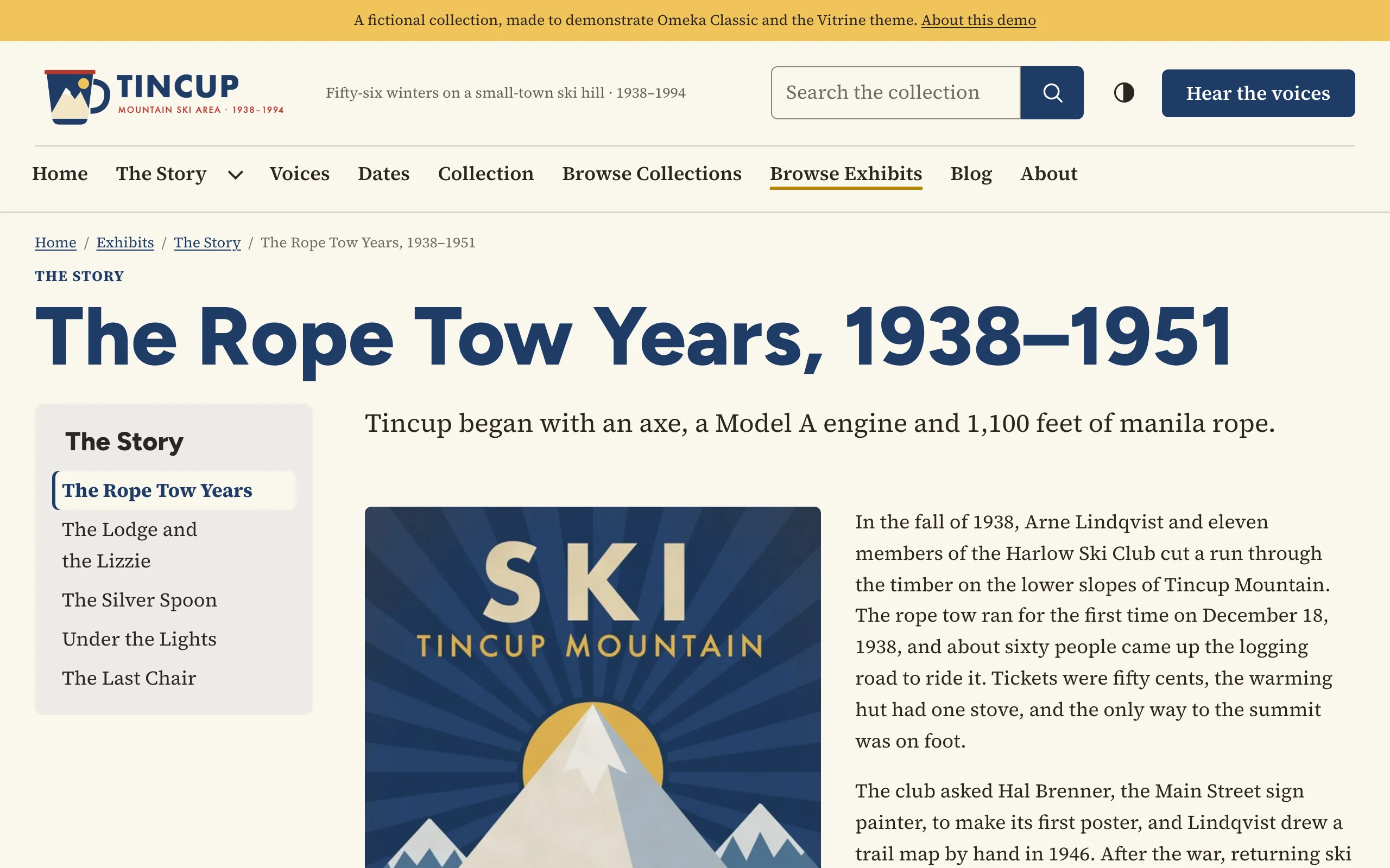
Exhibit settings
The Exhibits section of the theme's settings (Appearance › Themes › Configure Theme) has two settings:
| Setting | Choices |
|---|---|
| Exhibit navigation | Table of contents beside each page (default): the exhibit's pages listed beside the page, the current one marked; on phones the list comes first. Table of contents in a menu above each page: a Contents button under the page title that opens the list. Previous and next links only: no table of contents; the page's blocks take the full width. |
| Exhibit cover | How an exhibit's first page shows its cover image (Exhibit Builder's Cover Image, else the exhibit's first file). Large banner with the title (default): the image across the page, with the title and credits on it. Beside the description: the image next to the description. Not shown. |
Every page of an exhibit ends with Previous and Next links that name the pages they lead to.
Browsing exhibits
Browse Exhibits (/exhibits) shows each public exhibit as a card with its cover image and description, as a grid or a list as the Browse pages settings ask. Exhibits tagged in the admin can also be browsed by tag (/exhibits/tags).
To feature exhibits on the home page, tick Featured on the exhibit's edit page and choose how many under Home page › Featured exhibits. See Home page.
An exhibit's first page
An exhibit's first page shows its cover, title, description and credits, a Start the exhibit button, and its top-level pages as numbered cards under Contents. Write a description that says what the exhibit is about: it is also the exhibit's summary in search results and link previews.
Exhibit pages
Each page shows breadcrumbs (Home / Exhibits / Exhibit / Page), the exhibit's title above the page's own, the table of contents as the Exhibit navigation setting asks, the page's blocks, and the previous and next links. Exhibit Builder's Menu title of a page, when you give one, is the title used in the table of contents, the breadcrumbs and the previous and next links.
A visitor who opens an item from an exhibit sees the item's page within the exhibit, with breadcrumbs that lead back to it.
The five built-in layouts
Exhibit Builder builds pages from blocks, each with a layout. The theme draws all five:
| Layout | How it looks |
|---|---|
| Text | The block's text at reading width. |
| File with Text | The block's files beside its text, on the left or right (File position). File size sets their width: Fullsize takes up to half the column, Thumbnail and Square Thumbnail less. On phones the files come first, then the text. |
| File | The files on their own, on the left, right or center, at the chosen size, followed by any text. |
| Gallery | The files as a grid of thumbnails: square crops with Square Thumbnail, whole pictures with Thumbnail or Fullsize. With a Showcase file on the left or right, the first file is shown large beside the grid on wide screens. Each thumbnail opens the item's page within the exhibit. |
| Carousel | Exhibit Builder's own sliding carousel, framed in the theme's colors, with its title, captions and arrows. |
Captions (Captions position: left, center or right) come from each attachment's caption in the block.
Leave the carousel's Auto slide duration at 0. A carousel that moves on its own has no pause button, and moving content is hard to read for many visitors. Visitors move through the slides with the arrows.
Text in exhibit blocks
Block text works like a Simple Page: shortcodes (such as [items num=4]) and the theme's content classes (lead paragraph, callout, pull quote, columns, call to action, link cards, picture galleries…) work in every block's text. See Simple Pages and content classes. Exhibit Builder's editor has a Source code button for pasting HTML, and Omeka's HTML filter applies to exhibit text as it does to Simple Pages.
More layouts with BlockSuite
The BlockSuite plugin adds sixteen more layouts to the exhibit page editor, such as Hero, Call to Action, Statistics, Timeline, Item Cards, Item Slider, Tabs and Accordion. They print the theme's own markup, so they take its look.
An exhibit with its own theme
In an exhibit's edit page, Exhibit Builder's Theme menu can give that exhibit a theme of its own, and the Configure button beside it settings of its own. Use it, for example, for an exhibit in a different preset or palette, or with another exhibit navigation.
- The exhibit's first page, its pages and the item pages opened from them use the exhibit's theme and settings. The list of exhibits and the rest of the site keep the site's.
- Once you save the exhibit's settings, they replace the site's settings on the exhibit's pages: all of them, not only the ones you changed. Set the logo, colors and footer there too, so the exhibit looks like part of your site.
- To go back to the site's theme and settings, choose Current Public Theme.
The Design Studio plugin changes the site's settings; an exhibit with its own theme keeps its own.