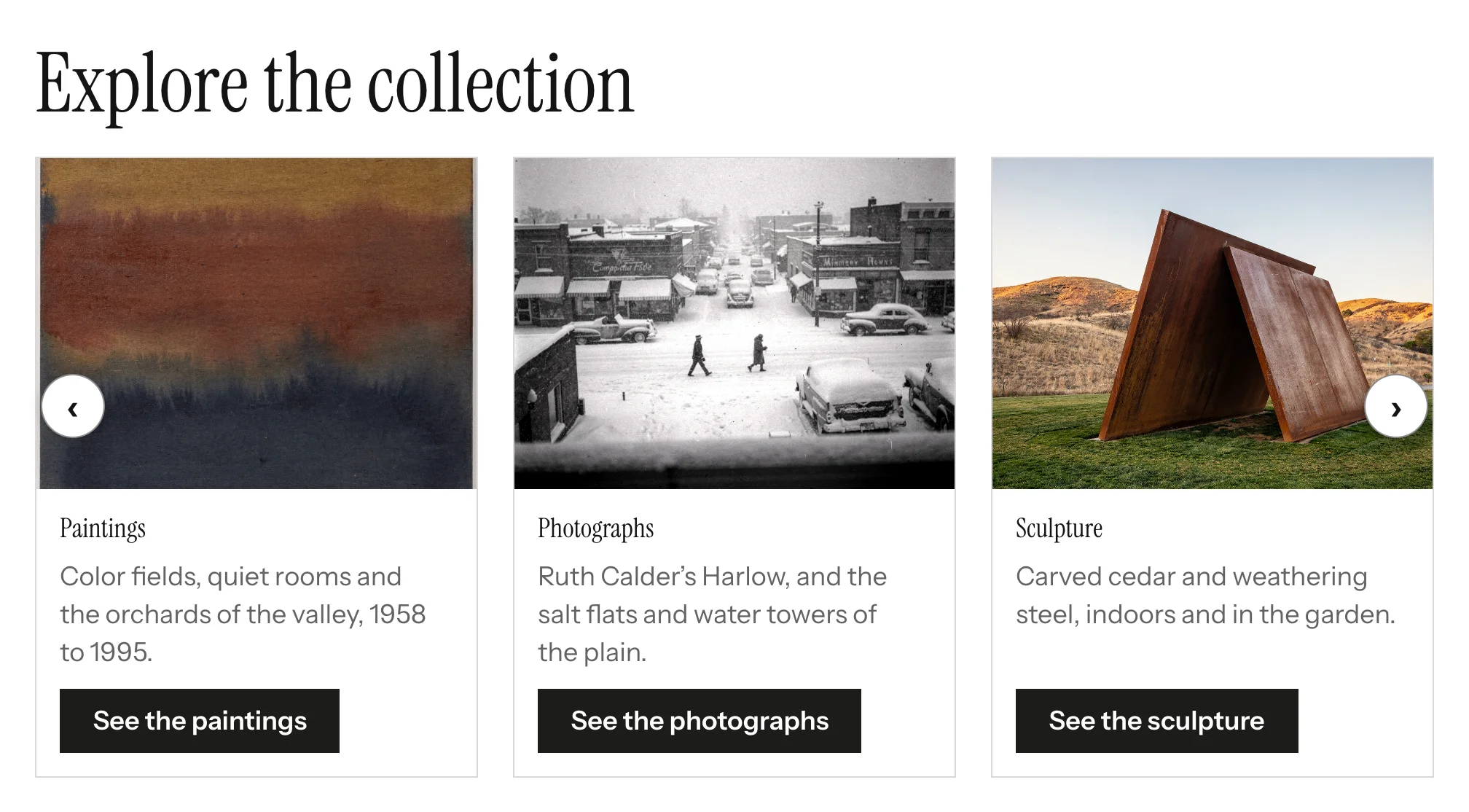
The Card Slider shows cards you write yourself (an image, a title, a short description and an optional link) as a sliding row or as a grid. Use it for feature panels, highlights on a landing page or a set of entry points into the site.
Adding the block
- Edit the page under Admin > Sites > (site) > Pages > (page).
- In the Add new block sidebar, click BlockSuite: Card Slider.
- Fill in the block settings and add at least one card.
- Click Save.
A Card Slider with no cards renders nothing on the public page.
Block settings
| Field | Description |
|---|---|
| Show as | Slider (one row that scrolls, the default) or Grid (all cards visible). A block with a single card always shows as a grid. |
| Heading | Optional heading shown above the cards as an <h2>. Also used as the slider's accessible name. |
| Cards visible | 1 to 6 (default 3). In a slider, the most cards shown at once; in a grid, the number of columns on wide screens. |
| Autoplay | Tick Auto-advance slides to move to the next card automatically (sliders only). |
| Autoplay interval | Milliseconds between slides, shown only when autoplay is on. Default 4000; values below 1000 are raised to 1000 on save. |
Cards
Click Add card to add a card. Each card has:
| Field | Description |
|---|---|
| Title | Required. A card with an empty title is dropped when the page is saved. Rendered as an <h3>. |
| Description | Plain text, shown under the title. HTML is not interpreted. |
| Image | Click Select to choose an asset from the sidebar, or Clear to remove it. The image's alt text is the asset's alt text; leave that empty when the image is decorative, since the card title already names the card. |
| Link URL | Optional. When set, a button link is rendered at the bottom of the card. |
| Link label | Text of the button. Defaults to Learn more. Screen readers also hear the card title, so several "Learn more" links stay distinguishable. |
Use the up and down arrows in the corner of each card to reorder cards, and Remove card to delete one. Changes take effect when you save the page.
If an image asset is later deleted from Admin > Assets, the card keeps its text and renders without an image.
On the public site
Grid: all cards are visible, in as many columns as Cards visible (fewer on narrow screens, one on phones). There is no script involved.
Slider: the slider follows the WAI-ARIA carousel pattern.
- It fits as many cards as the block's own width allows (about 15rem each), up to Cards visible, so a slider in a narrow column shows fewer cards than one across the page.
- Previous and next buttons move one card at a time and wrap around at the ends. Visitors can also use the left and right arrow keys while focus is in the slider, or swipe on touch screens.
- Cards that are scrolled out of view are inert: they cannot receive keyboard focus and are hidden from screen readers.
- Each card is announced as "1 of 5", "2 of 5"…, and a polite live region announces the visible range ("Showing 2 to 4 of 5") after the visitor moves the slider.
- With autoplay on, a Stop automatic slide show button comes first. Hovering over the slider pauses it; moving keyboard focus into the slider stops it until the visitor presses Start automatic slide show. Autoplay never starts for visitors whose system asks for reduced motion.
Theme authors can restyle the cards with the classes and custom properties listed in Theming and Markup.