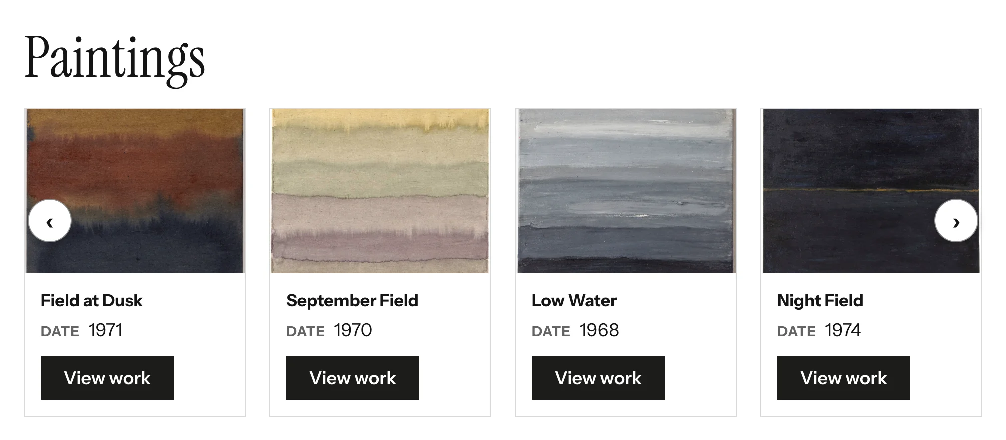
The Item Slider shows Omeka items as slider cards. Each card has the item's thumbnail, the metadata properties you choose, and optionally a link to the item page. You can pick the items by hand or let a query select them at render time.
Adding the block
- Edit the page under Admin > Sites > (site) > Pages > (page).
- In the Add new block sidebar, click BlockSuite: Item Slider.
- Choose a Selection mode and configure it (see below).
- Click Save.
An Item Slider that finds no items renders nothing on the public page.
Selection mode
Choose specific items
The block uses Omeka's standard attachment picker. Click Add attachment, pick an item in the sidebar, and it is attached immediately. Drag attachments to reorder them; the slider shows them in that order. Only the first Max items attachments are shown.
Show items by search criteria
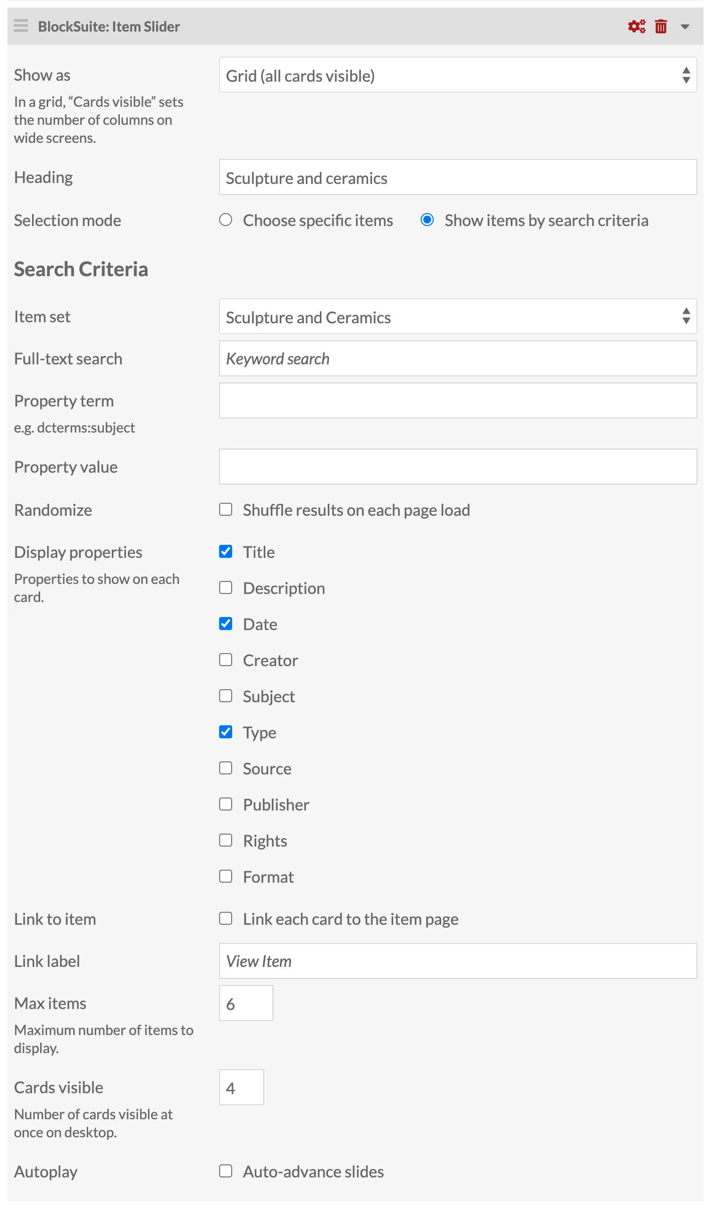
The items are searched when the page is rendered, so the slider updates itself as your collection changes. The search is always limited to items assigned to the current site.
| Field | Description |
|---|---|
| Item set | Restrict to one item set, or Any item set. |
| Full-text search | A keyword search, the same as the site's search box. |
| Property term and Property value | Show only items where the property equals the value exactly, for example dcterms:subject and Bridges. Both fields must be filled in for the filter to apply. |
| Randomize | Tick Shuffle results on each page load to sort randomly instead of by Omeka's default order. |
The result is capped at Max items. Items that are private, or not assigned to the site, are not shown to public visitors because the search runs with the visitor's permissions.
Display settings
| Field | Description |
|---|---|
| Show as | Slider (the default) or Grid. In a grid, Cards visible sets the number of columns on wide screens. |
| Heading | Optional heading above the cards. |
| Display properties | Tick the properties to show on each card: Title, Description, Date, Creator, Subject, Type, Source, Publisher, Rights, Format. The title is shown as the card's title; the others as a small label and the property's first value. Properties with no value on an item are skipped. Dates stored in machine form (such as 2025-07-07T21:21:57Z, 1987-04-12 or 1958-06) are shown as people write them, "July 7, 2025", in the site's language, without a time; other dates show as written. |
| Link to item | Tick Link each card to the item page to add a button linking to the item on the current site. |
| Link label | Text of that button. Defaults to View item; screen readers also hear the item's title. |
| Max items | Maximum number of items to show, 1 to 50 (default 12). |
| Cards visible | 1 to 6 (default 3), as for the Card Slider. |
| Autoplay and Autoplay interval | As for the Card Slider. |
Thumbnails
Each card shows, in order of preference:
- the item's thumbnail asset, if one is set on the item;
- the large thumbnail of the item's primary media;
- a plain placeholder panel in the theme's colors.
When the card shows the item's title, the image has empty alt text, because a screen reader would otherwise read the title twice. Otherwise the alt text is the item's title.
On the public site
The Item Slider behaves exactly like the Card Slider, as a slider or a grid. The wrapper carries both card-slider-block and item-slider-block classes so a theme can style the two together or separately; see Theming and Markup.