The Tabs (Blocks) container puts other page blocks inside tab panels, or inside accordion sections that open and close. Any block that can be placed on a page can go in a tab: HTML, media, browse previews, lists of pages, sliders, and so on. The container works like a core Block group: it "spans" the blocks placed inside it in the editor, and BlockSuite: Tab / Section divider blocks mark where each tab or section starts.
Building a tabbed section
- Edit the page under Admin > Sites > (site) > Pages > (page).
- In the Add new block sidebar, click BlockSuite: Tabs (Blocks). The block appears with an empty drop zone.
- Optionally give the container a Heading, shown above the tabs, and choose Show as Tabs or Accordion.
- Add a BlockSuite: Tab / Section block and drag it (by its handle) into the drop zone. Enter its Tab or section label, for example Overview.
- Add the blocks that belong in that tab and drag them into the drop zone below the divider.
- Repeat steps 4 and 5 for each further tab.
- Click Save.
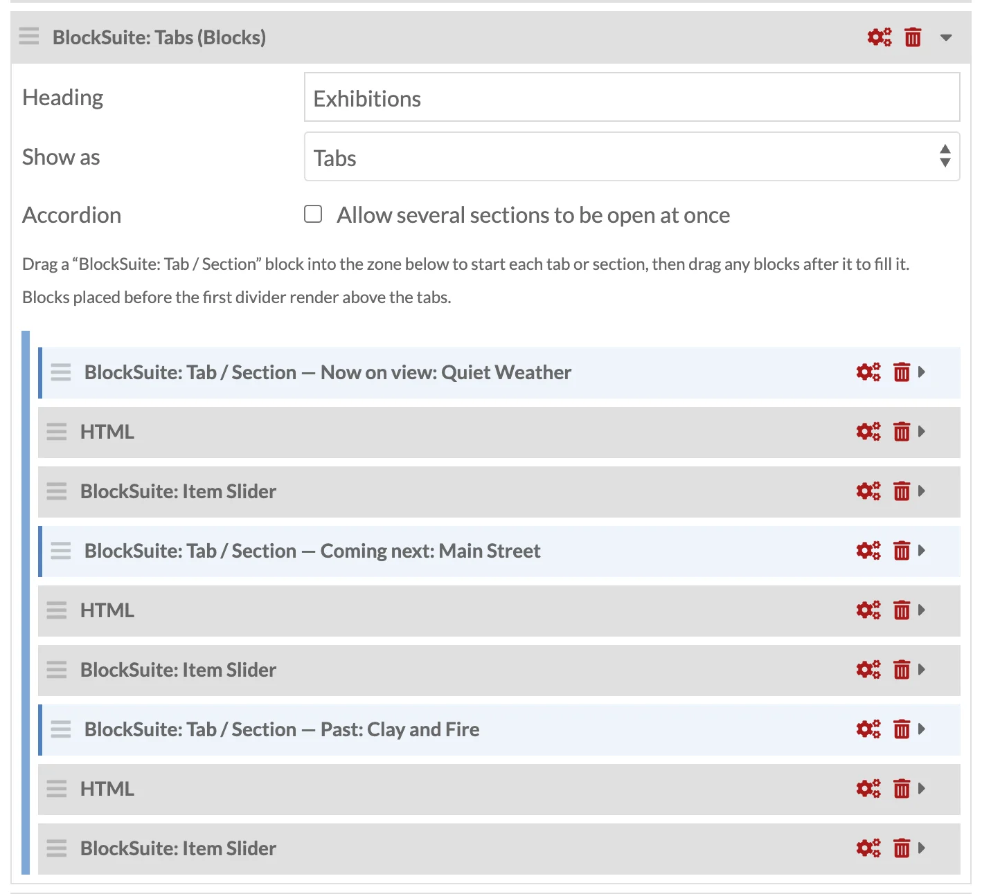
The tabs are defined purely by order inside the drop zone: a divider starts a tab, and everything after it until the next divider (or the end of the container) is that tab's content.
Container settings
| Field | Description |
|---|---|
| Heading | Optional <h2> above the tabs or sections. |
| Show as | Tabs (the default) or Accordion (sections that open and close). |
| Accordion | Tick Allow several sections to be open at once to let visitors open more than one section. |
The Tab / Section divider
| Field | Description |
|---|---|
| Tab or section label | The text on the tab or section button. If left empty it is labelled Tab 1, Tab 2 and so on by position. |
| Open by default | Tick Open this tab or section when the page loads. As tabs, the first ticked divider wins and, if none is ticked, the first tab opens. As an accordion, every ticked section starts open and, if none is ticked, all start closed. |
The divider renders nothing itself. In the page editor its header shows the label live, as BlockSuite: Tab / Section — Overview, and the block is accented with a blue left border so boundaries are easy to see when blocks are collapsed. A divider placed outside a Tabs (Blocks) container is ignored on the public page.
Intro blocks
Blocks placed inside the container before the first divider are rendered above the tab list, inside the container. Use this for a short introduction that should be visible whichever tab is open.
Nesting and limits
- A Tabs (Blocks) container can be placed inside another Tabs (Blocks) container, inside a Columns (Blocks) container, and inside a core Block group. Columns can go inside a tab or section too.
- A core Block group cannot be dropped into a Tabs (Blocks) container; the editor refuses the drop, as it does for block groups inside block groups.
- A Tabs (HTML) block inside a tab panel works normally; each tab list only controls its own panels.
- Removing the container with its Remove block icon also removes every block inside it, as the header warning Block and contents to be removed indicates. Drag blocks out of the container first if you want to keep them.
- On a page using the Grid layout, the container is positioned as a single grid cell using its own Position and Span (from Configure layout). The blocks inside are laid out within the tab panels, not on the page grid.
What happens when you save
The container stores how many blocks it spans; the editor recounts this every time a block is dragged in or out, and again on save, skipping blocks marked for deletion. Block order on the saved page is the order shown in the editor, with the container's blocks immediately after it.
On the public site
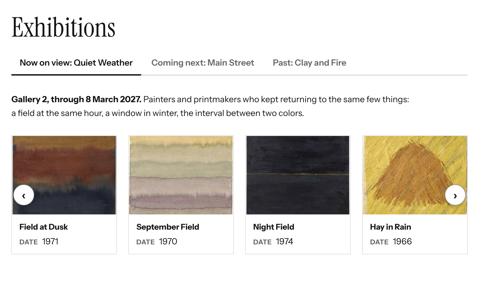
A container with a heading, intro blocks or at least one tab renders tabs or an accordion with the same accessible markup and keyboard behaviour as Tabs (HTML). A container with nothing inside renders nothing at all.
When a tab or section opens, it fires a bst:panel-shown event and a window resize event, so maps, charts and sliders inside it can redraw at their visible size.
The wrapper carries the bst-tabs-block bst-tabs-block--group classes; see Theming and Markup. Rendering is done by the module's pageLayout view helper override, described in Configuration.