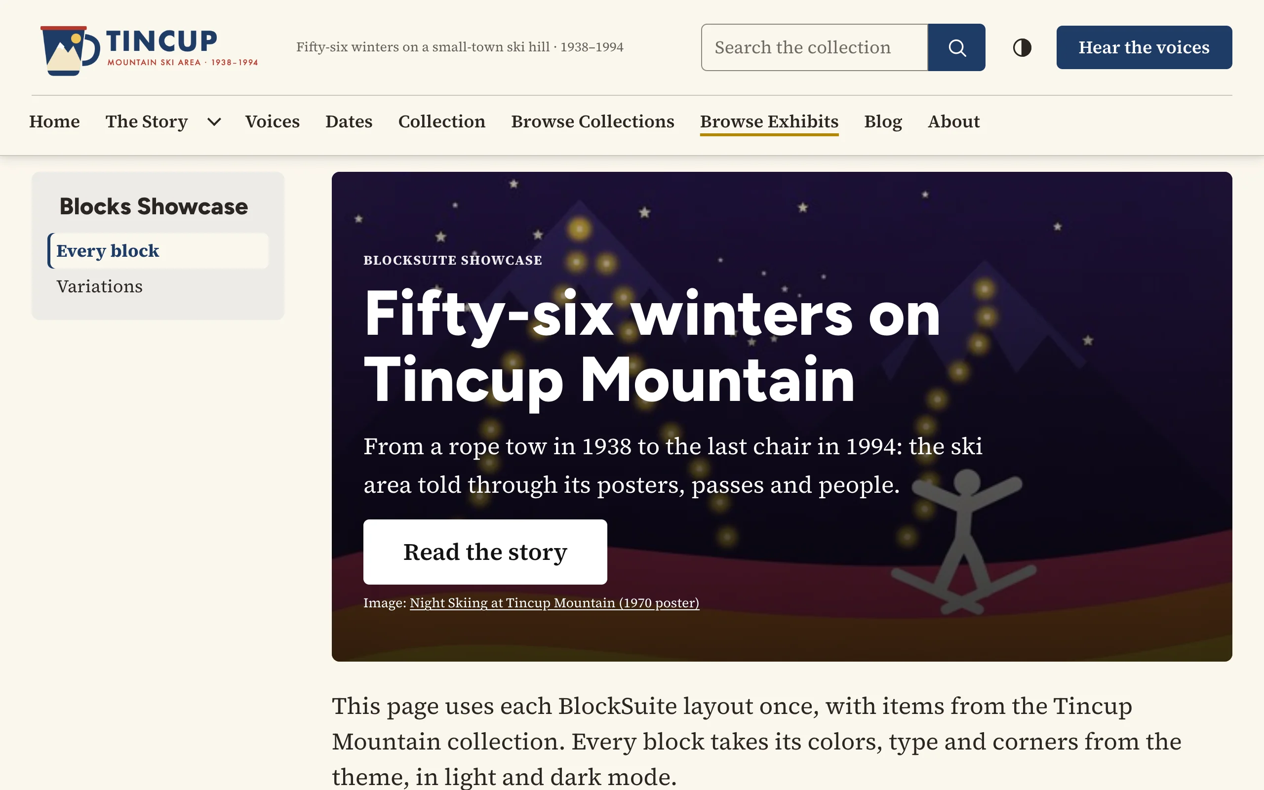
The Hero opens a page or a section with a large heading over, beside or below an item's image, a sentence or two of text and an optional button.
Adding the block
- Edit the exhibit page (Exhibits > (exhibit) > Edit, then Edit next to the page).
- Under New Block, choose Hero and click Add new content block.
- Click Add Item and pick the item whose image you want. Only the first item is used.
- Write the text, open Layout Options, then Save Changes.
Options
| Option | Description |
|---|---|
| Image (first item) | Its file's full-size image fills the hero. Without an item the hero is a plain panel in the theme's dark color. |
| Text | Optional; a sentence or two under the heading. Links in it take the hero's text color. |
| Style | Text over the image (under a dark overlay), Text beside the image or Text below the image. |
| Heading | When empty, the item's caption is used, else the item's title. |
| Heading level | Heading 2 (default; the page title is the Heading 1) or Heading 3. |
| Eyebrow | A short line above the heading, such as a date or a section name. |
| Button label, Button link | Both needed for a button, except that a label with no link opens the item (within the exhibit). A link can be a full address or a path such as items/browse?tags=Posters, which works in a subfolder install too. |
| Height | Compact, Standard or Tall, for text over the image. |
| Keep in view | The part of the image that stays visible when it is cropped: top, center or bottom. |
| Credit the item | Adds "Image: (item title)" under the text, linked to the item. Not shown when the heading already is the item's title. |
On the public site
The hero is the theme's own .v-hero component, so it looks like the hero on the theme's home page. Over an image, a dark overlay of at least 60% keeps white text above 4.5:1 contrast on any photo. The image's alternative text comes from the file's description or title (empty when the heading is the item's title, so it is not read twice). An empty hero (no item, heading or text) prints nothing.