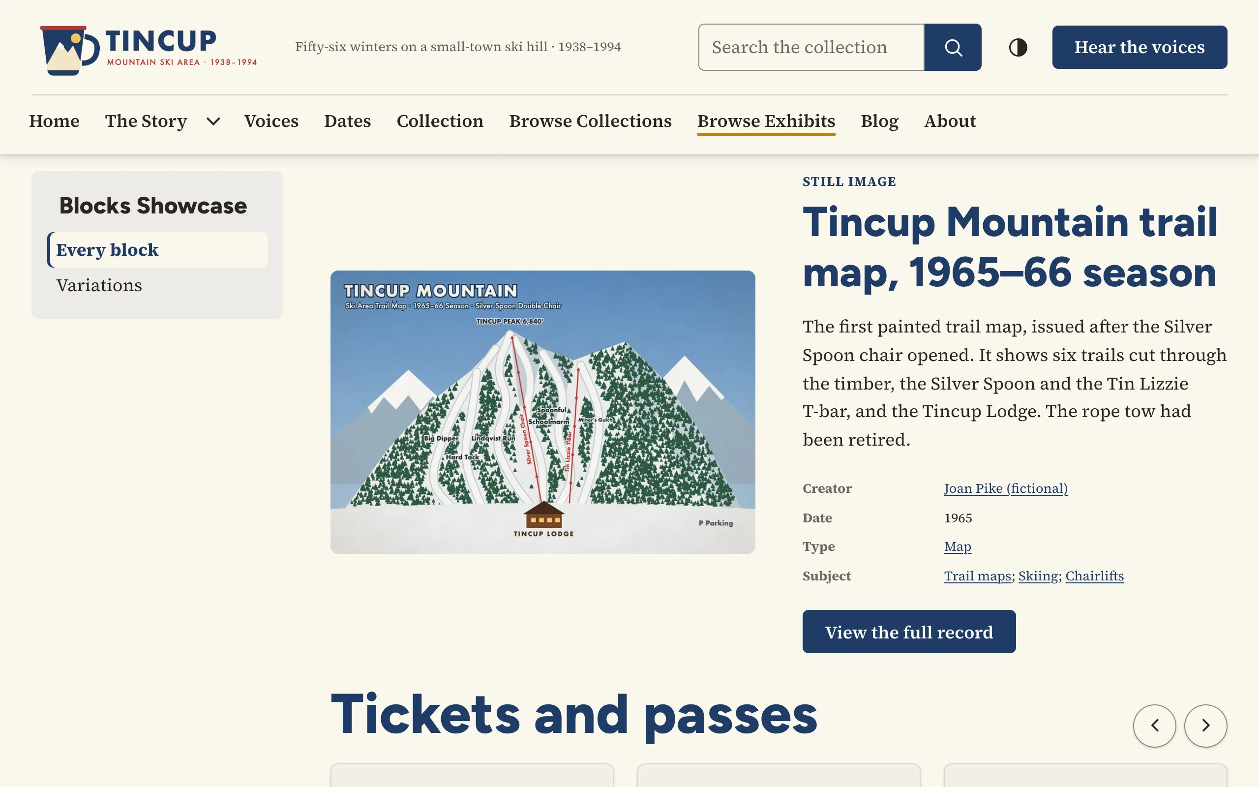
The Spotlight shows an item large: its image, its type, its title, a description, a few key fields and a button to its page.
Options
| Option | Description |
|---|---|
| Items | Usually one. Each item gets its own spotlight; with several, the images can alternate sides. |
| Text | Optional; replaces the description of the first item, when that item has no caption. A caption always replaces its item's description. |
| Title level | Heading 2 or 3 for the item's title. |
| Fields | Dublin Core fields listed under the description when the item has them: Creator, Date, Type and Subject by default; also Contributor, Format, Publisher, Source, Coverage, Identifier, Language and Rights. |
| Image position | Left, right, or alternate (several items). |
| Show the item type | The item type as a small label above the title. |
| Button label | Default View the full record. The item's title is added for screen readers, so every button has a distinct name. |
On the public site
The theme's .v-spotlight component: image and text side by side on wide screens, stacked on phones. Field values keep Omeka's display filters (for example, search links added by other plugins), and dates read as people write them.