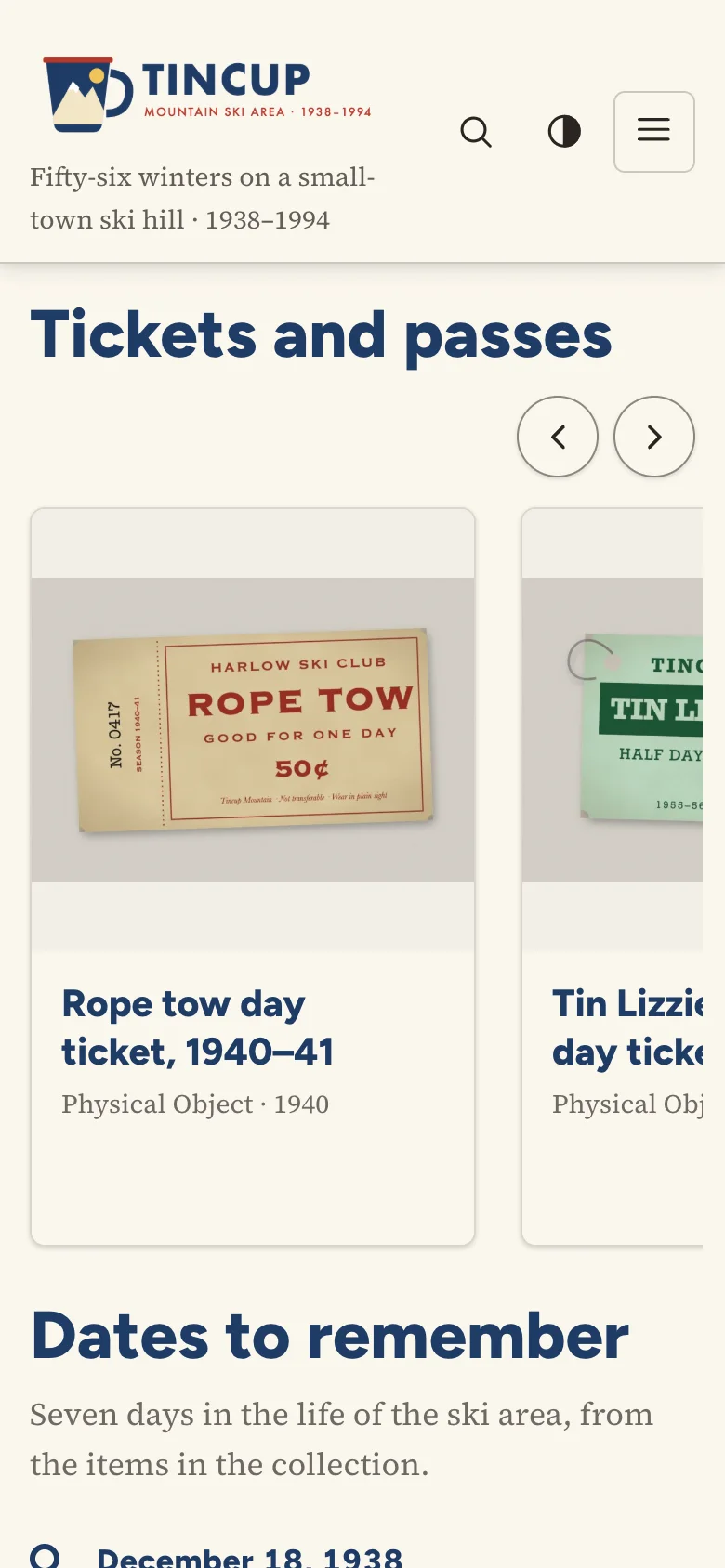
The Item Slider shows the attached items as cards in a row that slides sideways, with previous and next buttons and an optional slide show.
Options
| Option | Description |
|---|---|
| Items | The items, in order. |
| Introduction | Optional text above the slider. |
| Heading, Heading level | Recommended: the heading names the slider for screen readers (without one it is called "Items"). |
| Cards in view | 1 to 4 on wide screens. Narrow screens show fewer, with the next card peeking in, so it is clear the row scrolls. |
| Card text | The caption, else the description; the description; or none. |
| Slide automatically | Starts a slide show; see below. |
| Seconds per step | 4 to 10. |
Accessibility
The slider follows the WAI-ARIA Authoring Practices carousel pattern:
- It is a region named by its heading, described as a "carousel".
- The previous and next buttons are always visible when the row is wider than the slider, and move a whole view of cards at a time, wrapping around at the ends. After a move, a polite live region says which cards are shown ("Showing 4 to 6 of 7").
- The slide show has a Stop automatic slide show button placed before the cards. The slide show pauses while the pointer is over the slider, stops for good when keyboard focus enters it (until the visitor presses Start again), pauses while the browser tab is hidden, and never starts for visitors who ask for reduced motion.
- The row is a native scroll area with snap points: it scrolls by swipe, trackpad and keyboard focus, and without JavaScript it simply scrolls.
Coexistence with jCarousel
The slider does not use jQuery or jCarousel, and its markup has no .jcarousel classes, so Exhibit Builder's Carousel layout and the Shortcode Carousel plugin (both of which start every .jcarousel on the page) leave it alone. The classes (.card-slider-block…) are those of Block Suite for Omeka S. Also available as [bs_items display="slider"].